Sunday, 18 December 2016

RWA 164 Annual Open Exhibition 

MAN IS THE MEASURE OF ALL THINGS - November - December 2016

Here are a series of eclectic work produced by a mixture of Academicians and external artists using a combination of media including textiles, oil paint, photographic and stitched which I found inspirational. The range and quality of work was variable yet resonant; particularly the sculptural work of Tim Shaw, the Renaissance style pastiche portrait by Rosalind Robinson and the intimate, detailed portraits of Leslie Glenn Damhus. 
The intricate lace pointillist inspired patterned photograph 'Armour Studies - Lace IV' by Jessa Fairbrother was reminiscent of Elizabethan lace detail. Also the beautifully ornate handmade golden frame surrounding the sinister, translucent oil portrait of 'Miss X', appealed as it is the combination of emotive portrait with exactly this style of frame that could be used for my own digital print work. 
The majority of work was figurative or contained some aspect of 'humanity' which, in my opinion, was mirroring the Renaissance ideal -  'production of its own invention of humanism' ergo 'man' really is the measure of all things.


Tim Shaw
Tim Shaw’s sculpture ‘Eric’ is both other 0worldly and yet very much of this world. It is politically charged and confrontational, yet beneath the rough-hewn surfaces – often welded, stitched or bound together – there is a fragility and tactility that is inherently human.
 Rosalind Robinson
‘We Two Together Leaning’
oil on panel

Leslie Glenn Damhus
Lady of the Columbine
Oil on board

Leslie Glenn Damhus
Lady of the Celandiine
Oil on board


Jessa Fairbrother
Armour Studies (Lace IV)
Black and white unique photograph,
Pin pricked by hand


Mark Sheeky
Miss X
Oil on canvas in custom frame


The intellectual basis of the Renaissance was its own invented version of humanism, derived from the rediscovery of classical Greek philosophy.  "Man is the measure of all things."

Wednesday, 14 December 2016

31st UWE Annual Miniature Print Exhibition


My silkscreen print 'Tiny Lady' is displayed bottom left.

GIRL ON GIRL

In order to prepare for the imminent end of the MA, I have started to think about displaying my figurative work in both two and three dimensions.  There are a few initial issues that I am researching:

How best to present my work this in order to highlight the female portraits and accentuate aspects of these feminine Renaissance forms?

On what material would I print my work?

Which fabric would be most effective in representing the qualities of these rounded shapes and accentuate their qualities?

Why not begin by producing a range of wearable art where women wear my women? 

With my theme of femininity, it makes sense that the female body becomes the canvas for a selection of my work. Unsophisticated garments that drape and highlight my actual printed  design without distraction are essential. So, a simple construction would emphasise my feminine designs most effectively with the print juxtaposed alongside the human form. 
The 'Shift dress' was one example of a simple construction that could be made easily with the emphasis being on the pattern not the dress (the dress becomes the frame for the print).

A ‘Shift dress’ is a short dress that lacks detailed shaping and is usually sleeveless. These dresses are generally plain and were popular in the late 1950s and 60s.


Saturday, 26 November 2016

DIGITAL PRINT TEXTILES – Patterns and Swatches


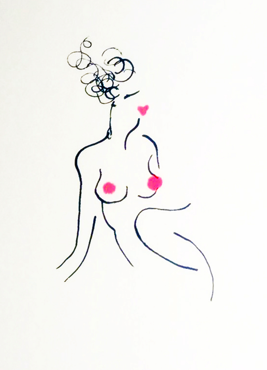
I have been experimenting with figurative patterns, random fill nudes, circles and spot shapes. These examples incorporate my drawn human forms and combine selected colours from chosen Renaissance portraits to use as solid backgrounds for textile prints. This sampling of colours from the selected images adds continuity to each of my textile and digital pieces.

ORANGE taken from my interpretation of ‘the Armada’ by George Gower 
(Portrait of Elizabeth 1)


RED taken from my interpretation of the portrait of ‘Isabel Dona de la Porcel’ 


by Francisco Goya

UMBER taken from one of a series of my interpretations of 
‘Portrait of a Lady’ by Rogier van der Weyden

I used Photoshop fills editing a range of figures in spiral, symmetrical and random designs and adding a background coloured layer. Each of these designs could be translated into swatch ideas.

Linen seems to be the most effective fabric for print.  The obvious ‘slubby’ textured structure of this fabric is visible through the printed colour to represent the look of paint on canvas and it drapes and folds beautifully. However, I have a range of fabric samples to test until I find the most suitable for drape, shape and colour examples include:
 Silk Habotai Heavy, Silk/Viscose Satin (Devore), Twill Silk, Satin Silk and Cotton Valdez.

The final outcomes from these experiments are fluid and not refined yet, but could be sculptural constructions for garments or translated into silkscreen prints or repeat patterns for soft furnishing fabric.


Tuesday, 15 November 2016


The oil portrait of Dona was painted by Goya around 1805 and depicts Isabel Lobo Velasco de Porcel. This half-length portrait shows a young woman dressed in typical Spanish attire, a white shirt and a black mantilla (a traditional Spanish lace shawl). 

The composition of the painting – the lighting on the face of the subject, the muted yet descriptive colours used and the traditional Spanish costume worn, have been deliberately chosen by the artist to give an indication of this woman’s social class, status and personality, also the manner in which she is posed; facing away from the artist with her pale neck exposed with rosy cheeks and left hand on her hip all combine to accentuate her youth but also her strength.
It is the idea of feminine strength which drew me to the portrait – vulnerable yet voracious.

I painted and printed my own ‘dona’ on canvas using acrylic and house paint and then monoprinted backgrounds of acrylic colour with varying thickness and transparency. I had to pack the back of my canvas in order to print directly onto it on a screen bed, but through these printed sections I stamped patterns directly onto the surface of the canvas (using corks and plastic bottle tops) to exaggerate the texture and energy within this piece. I also used my own photographic hand and eyes within the painting and used black lace in collage form to depict the ‘mantilla'. In fact, the eyes of the subject are my focus and I have experimented with photographic and painted versions. She follows you around the room like a ‘Cluedo’ character - Miss Scarlett or Dr. Orchid. Abstract bubbles containing more of my figurative females have been silkscreen printed as a background for a stencil version of this work too. (see next blog entry).


My absolute favourite 'dona' design is my digital version where I have combined a series of random nude life drawings with my vibrant plump, bubble red background and scanned in a hand stencil painted portrait – in my opinion the curved themes within this example emphasis her strength of character are most effective. (see www.clarewyattart.com ) 

The Spanish painter's works give intimate insight into his subjects’ psychology and incisive social commentary on a dramatic period of Spanish history.
The decisive gesture of her arms and her confidence stand out. Her eyes and hair are light brown, her skin is pale, and her body is slightly turned to the left side, while her head gives balance by being turned to the opposite side. Goya achieves realism and deepness without adding secondary objects to the composition. One of the unique aspects of this painting is that the woman is looking towards the left side of the viewer and not towards him, which is the case of the majority of Goya's paintings.
http://www.historytoday.com/kate-wiles/goya-portraits