Saturday, 15 November 2014


The Enamelling Workshop

SiO2 & CuO ... the true method of knowledge is to experiment
William Blake

13th November 2014

... made by fusing powdered glass to a substrate by firing, usually between 750 and 850 °C (1,380 and 1,560 °F). The powder melts, flows, and then hardens to a smooth, durable vitreous coating on metal, or on glass or ceramics.

http://www.janlyjaggard.com/
http://janinepartington.co.uk/view-enamels/copper-series/
http://www.daledevereuxbarker.co.uk/
http://www.swarez.co.uk/

See Colouring Light: Brian Clarke - an artist apart. BBC 4
http://www.brianclarke.co.uk/about


My preconception of enamelling was that it was a process for grown ups. I thought it exclusive and inflexible. I was first introduced to these shiny metallic slabs of 'abstract' gorgeousness in the early 90s following my Illustration degree by looking at the work of Elizabeth Turrell and Janly Jaggard, who were lecturing at the School of Art and Design in Bristol. Also looking at the intricate enamel pieces of the then new jewellery designer Kit Heath, in conjunction with Mappin and Webb Jewellers in London.  

Arriving at the Fabrication centre at 10am I was feeling slightly ruffled. Comme d'habitude, I did not have a clear direction - other than needing a Cornetto from the shop - having already been screen printing A2 'juicy landscapes' with the irrepressible Mr. Fortune and a series of anxious MA 'mini-printers' since 8.15am.
Rachel Merelie, our elegant enamelling tutor was inspiringly passionate about this process and my Cornetto hunger slowly evaporated, being replaced by 'Champleve, Cloisonné and Copper Oxide' cravings.
We were given instruction in the science of metal and glass fusion that is the Enamelling process and shown how to 'chop', 'nibble' and 'punch' our copper sheets to create a variety of marks before degreasing the metal and adding the 'counter glaze' to the underside of our copper. This metal was then fired in the kiln at a temperature of about 800 degrees from 30 seconds to 6 minutes depending on the size of the original piece of metal. Health and safety was paramount. I wore huge industrial gloves and welding goggles in order to put my work in and take it out of the kiln - bit of a Flash Dance vibe.

Once removed from the kiln and the metal had cooled,  the sooty black residue or 'Fire Scale' has to be scoured away before adding the next glaze.  Rachel was on hand with advice and I experimented with underglaze pencils (being impatient) tried  'under firing' my work which gives a greener tint to the white vitreous enamel.

I loved the red textures created by the chemical reaction of clear glaze on raw  metal with the application of heat and some of my first glazes were beautiful.. Martian landscapes in miniature and linked perfectly to the volcanic paintings of Cesar Manrique. My abstract textures and patterns evolved by trial and error and I loved the spontaneous nature of this process. I found Enamelling, although painful at times, a very satisfying and expressive process; a chaotic, but paradoxically, considered duality between two and three dimensions.  For me this evocation of texture is captured by Gerhard Richter and the huge painted textural responses by Anselm Kiefer to his past, present and future: 

" He is the most liberating painter since Jackson Pollock. Like Pollock, Kiefer transforms a painting from a picture to be contemplated into a fact that splashes out into the world. Pollock often left bits of rubbish on the surface of his paintings; cigarette butts that fell in the wet paint, for instance. And Kiefer, who includes Pollock-esque drips among the marks he makes, also leaves everything from woodcuts to organic matter encrusted on his art’s rich surfaces. But the effect is utterly different from the late American artist". Jonathan Jones-The Guardian September 2014

http://www.theguardian.com/artanddesign/2014/sep/22/anselm-kiefer-royal-academy-of-arts-review

In the words of 'Forrest Gump' enamelling is like 'a box of chocolates .. you never really know what you're gonna get'.


Thursday, 13 November 2014


The Silkscreen Sessions

I print, therefore I am...

6th November 2014

After the excitement of the Marvellous Manrique I was looking forward to producing work which could be inspired by his vibrant textural colour paintings and large scale mosaics eg. volcanic oil studies and garden sculptures; combining this with my own fine linear drawing. I wanted to use silkscreen and lithography for these initial studies as I thought the processes would produce the most effective results for both fine line and textured block abstracts on a smooth photo plate or thin grade paper.  
Abstrakter Bild - Richter

I loved Manriques' Miro-esque collages, metal figurative garden sculptures and the limited colour palette and patterns contained within his oily mixed media canvasses which evoked the landscape he loved. (See Kyffin Williams, Kurt Jackson and Gerhard Richter whose visual work is also suggestive of rough textural planes but especially the tactile quality of a surface). 

https://www.gerhard-richter.com/en/
http://kurtjackson.com/
http://www.kyffinwilliams.info/oriel-kyffin-williams.html

I love the autumn for its sense of melancholy... There is poetry in the dying of the year and mystery as well.' Kyffin Williams

Skeisse zu Parkstuck - Richter
The starting point for this print work was my own sketchbook studies of the rugged island seascapes; cliffs and rocks, undulating and folding, simplistic yet extremely complex in its composition. 

Once the right sketches were chosen and I had scanned, re-touched and tweaked them, the structural landscapes were transferred onto acetate by the enigmatic Ben (a lovely male Mona Lisa). 
I used one of these A2 positives as the base for a range of experiments. However, time was not on my side. I attempted several mono prints as a basis for the keyline work and then also block textured transparent shapes to accentuate and define solid areas. This was supplemented by adding collage and drawing directly onto the screen and also onto the wet silkscreen prints. 

This exploratory work is ongoing, rather haphazard and to be continued ... Less Descartes more Des O'Connor, rather like me. 

Friday, 7 November 2014

yo te acuerda oh mi corazon 

Cesar Manrique 

29th October 2014


The integration of architecture and art in harmony, embedded in a love of his home and country is a synthesis of the 'Manrique' experience.
http://patternity.org/news/patterniquote-cesar-manrique-the-explorer/
http://www.cesarmanrique.com/juguetes_i.htm

In an attempt to quantify a definitive reason and perhaps a direction behind my artistic  outpourings (ugh) and to demystify the Aristotelian quote 'misfortune shows those who are not friends',  I abandoned my university chums and spent a little time soaking up creative 'atmos' in the orbit of that late visionary artist, architect and aesthete Cesar Manrique on the island of Lanzarote. 

A strange landscape of extremes; fecund yet barren -  where the tattoo rubs shoulders with the Tintoretto, Manrique's eclectic range of work from the silkscreen print to the sculpture, takes its inspiration directly from his Spanish roots. He uses the volcanic heat, vibrant colours and unusual textures found on this rugged island as the thread running through all the work he ever produced. This obvious passion for and direct link with his country and his life; this sense of 'who you are' through a combination of the tactile and the visual, I found overwhelmingly inspirational. 

Manriques' collection of art work is diverse and he uses his home as a gallery space as if as an 'aide memoir' showcasing his own work and taking inspiration from that of his friends; images of abstracted beauty ranging from Francisco Farreras to Gerardo Rueda, Jean Miro to Pablo Picasso. 

The backdrop to this as one meanders through the subterranean labyrinth that makes up his cool underground home, is the sound of trickling water and the sudden burst of cerelean and white as the obsidian lava bursts open to reveal a vast canvas of sky.

http://www.fcmanrique.org/recursos/publicacion/cesarmanrique1950-57.pdf
https://www.youtube.com/watch?v=r49JUDF07O8


The realisation for me was that creativity is life affirming and paradoxically transient yet constant. The textural content of the paintings and the colours in the landscape affected me like the metallic tang of ozone; sharp and tangible. The tactile abstraction of nature combined with mouthwatering colour is something I aspire to create with print - juicy silkscreen, fine lithography or crumbling, shiny enamels.
However small the beginnings, whatever direction you take, there is no 'wrong', there is acceptance and unusually large amounts of genitalia shaped cacti.


Sunday, 26 October 2014


Legends of Lithography 2 coming soon...

'From Tusche to Toulouse'

25th October  2014

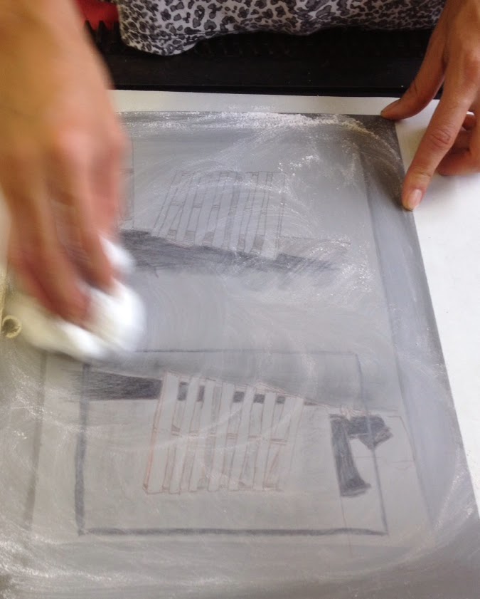
After all the evolutionary data, Professor Brian Cox aka Phil Bowden began our instruction into the chemical processes which Litho entails; the Gum Arabic application to 'stop out' marks, then drawing onto the surface of the desensitised plate with your choice of greasy nubs or nibs. 
The image created which can be drawn directly onto the plate or traced on via transfer paper coated with ferric oxide. The plate is then 'gum etched' and different levels of phosphoric acid to higher ratio of gum makes the image appear 'more' as you intend. The term 'tusche wash' reminiscent of a very private bathroom activity, allows for soft tonal blends to graduate over certain areas of your design giving a softer and more painterly feel.
I think the more 'familiar' way my image looked and actually felt after transferring my design onto the hard metal surface (like traditional drawing) made this process much more satisfying and overall made for a more successful final outcome in my eyes. I was pleased with my results, rather than the inadequate scrapings I achieved with etching. 

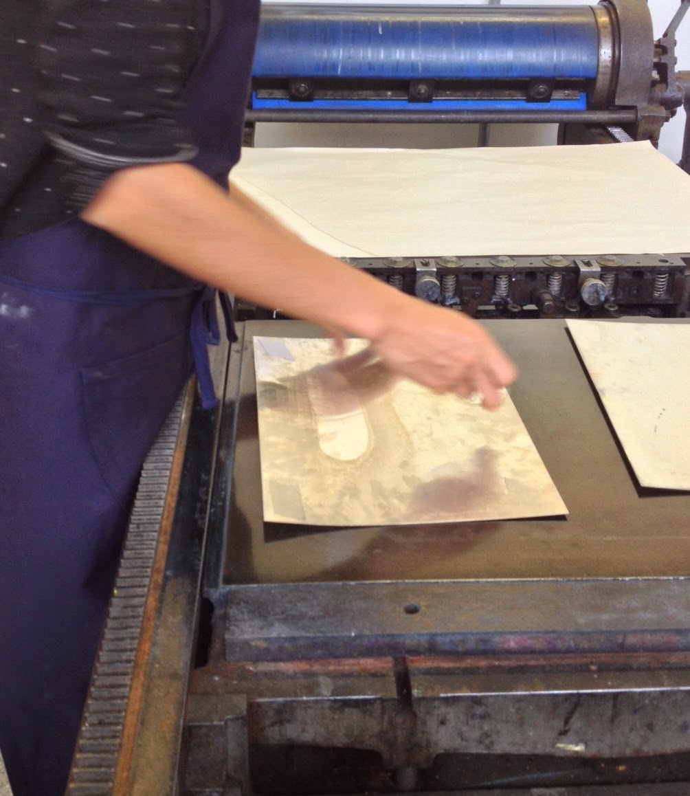
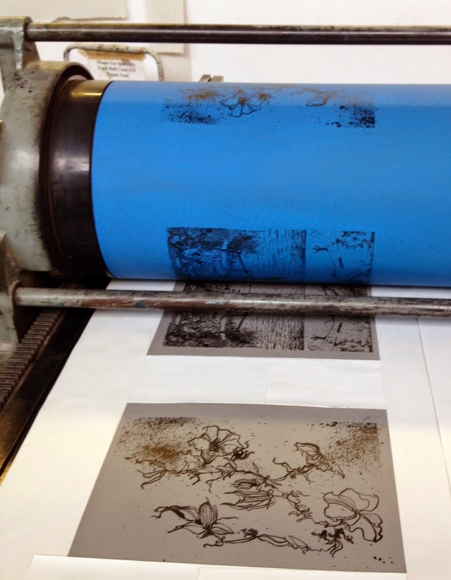
Once the plates had been talcum powdered, re-gummed 'puddled in' and inked up, the final stage - rolling out my first litho print- was a mini revelation (think finding a pound coin down the side of your sofa when you first thought it was a button)! 


It is amazing that I can reproduce many 'fresh' looking images from one inked up plate with no loss of detail or crispness of line. I think the textured marks and vibrancy of colour that this process allows is inspirational and more akin to silkscreen. I love the work of Toulouse-Lautrec, particularly his images of Jane Avril the good time girl who did not have it so good.  The brightness and clarity of this work is still strong and 'fresh' even after over a century. The romance evoked in some of Toulouse-Lautrec's graphic posters using this process spills over into the quintessentially British imagery by the doomed artist and war hero Eric Ravilious. 

Constructivism, Futurism and the art of the War posters have their place here.


 Imagine it, this is the concept of 'giving life' to a tangible creative reproduction. The Ascent of Man it's not, but that doesn't diminish this process any less.
http://www.theguardian.com/science/blog/2014/oct/14/brian-coxs-human-universe-presents-a-fatally-flawed-view-of-evolution

For me, the soundtrack to this process and the solidity and sense of 'forever-ness' these images produced, I was reminded of the lines from the song 'Photograph, by Ed Sheeran;

'...We made these memories for ourselves,
Where our eyes are never closing
Hearts are never broken
And time's forever frozen still'.


https://www.youtube.com/user/EdSheeran


Talkin' bout a Revolution not Evolution.. Eat your heart out Jacob Bronowski.


Saturday, 25 October 2014


Legends of Lithography

Eric Ravilious and me.

23rd October  2014

Lithographic printing was a paradox. My previous experience of the process was disappointing at best (a clumsy washed out scummy texture on stone - slimy yet dissatisfying) and after last weeks' 'schadenfreudic' (sic) experience with etching I was afraid, very afraid. However I really wanted to like it - rather like ones' first taste of an olive - and the process is one of the grand old men of the printing world, rather like the aforementioned Eric Ravilious; who apparently was 'inordinately fond of tea'. 


Phil Bowden was our 'Brian Cox' of Lithography. We started with Evolution; finding out that a Litho stone is perfect for printing because it is composed of pure Bavarian shellfish. This prehistoric recipe apparently creates a fine, dense and even surface for printing is also fabulous for fossils and rocks a pair of lederhosen. 
Using an Aluminium plate instead of a Limestone for this Litho workshop was more cost effective and much easier to carry around the studio, unless you happen to be Popeye. So after tracing our images down onto the plates we had a variety of greasy media to choose from to make our textured marks. I chose dip pen with Litho ink to draw out my botanical illustration. This created a loose and relaxed line which was much more satisfying than carving into copper or acetate (as in etching). It was comfortable and felt like drawing.

Thursday, 16 October 2014


Etching

Eat my Shorts.

16th October  2014

Etching, Aquatints and Drypoint were unknown processes to me - techniques which I had been exposed to briefly a lifetime ago when an art student. The word 'Alchemy' sprang to mind and the terms Ferric Chloride, Acid resist and Bitumen resin hung heavy in the air like the smell of the printing ink. Dave Sully assisted by Isaac gave an informative but gentle introduction to this precise and rather meticulous process.

A Copper plate (once de-greased) is covered in a Bitumen and Bees Wax ground and rolled flat. Onto this smooth marmite-esque surface heat is applied in the form of a candle to bond 'Air Soot' onto the plate. The soot covering the acid resistant layer allows you to see more clearly the fine copper line you create when drawing your image onto the plate.
It is important to remember that the printed image created is the mirror image therefore text must be reversed out.

I attempted to recreate the flowing lines of my life drawings but I found my normally loose drawing style very difficult to replicate. This was frustrating and working into the smooth shiny metal with a sharp, tooth-like needlepoint was like scratching my fingers down a blackboard - curves were clunky to achieve and unlike the fluid freedom that pen, brush and even lino cutting tools gave me, I found I was very disappointed with the results.

After scratching and scraping the coppery surface the plate is placed in an acid bath (Ferric Chloride is used as it 'bites' harder into the metal and gives more control, which in turn allows for finer drawing). The acid eats away at the metal leaving the areas covered with black ground undisturbed. The time spent in the acid is dependant on the lightness or heaviness of line required. An hour or so was the specified time for my acidy design.


Once the initial design has been revealed by the greedy acid monster, in order to prepare the plate for printing,  the sooty cloying resinous surface has to be carefully removed with solvent cleaner and gooey black ink is then applied with what looks like a miniature 'boxing glove' or large bingo dibber, to secrete ink into every available nook and cranny. Then any residual ink rubbed away using 'Scrim' (I intend to insert this word into my everyday vocabulary). The plate is then placed onto the press bed and pre-soaked paper placed on the top, followed by a piece of tissue, then the felt blanket covers it and you're ready to roll. 


My disappointment spilled over into my experimental 'Drypoint' test images. The Drypoint process is similar  but omit the acid bath and any biting occured was me masticating my way through chocolate fingers and shortbread left over from last weeks 'Welcome 1st years' party.

Dave, like a much younger and beard free Dumbledore, was magic - on hand with advice and kind words, praising my efforts despite my design having the look of an hermaphrodite carrying a set of golf clubs.

However, I intend to work on my etching technique but perhaps try a more sympathetic media for my future ideas.  I realise I prefer more fluid and immediate results. Silkscreen and Relief printing may be the way forward with a combination of textural experiments. The theme of 'Texture' is an avenue to explore further. 

Peter McGrath
My friend, the artist Peter McGrath has the hand of an alchemist. His photographic studies and paintings are descriptive observations of the human condition both fragile and powerful. Beautiful textural photographic work and an eclectic range of tactile organic oil paintings combine the figurative with the abstract.  http://www.petermcgrath.co.uk/


I also look to the work of Jonathan Borofsky who produces images which are figurative but also contain large, flat expanses of bold colour. His  Five large paintings from the 'Human Structures' series (2009) is particularly impressive.

'In this series...Borofsky continues to express the most integral theme in all of his work - that everything is connected, and All is One'.


Bite me.


After 'Le Corbusier' and 'Matisse'

Life Drawing and all that 'Jazz'.

16th October  2014


I prefer drawing to talking. Drawing is faster, and leaves less room for lies.  Le Corbusier


Le Corbusier and the Concept of Self

 By Simon Richards, Le Corbusier

Le Corbusier: Elements of a Synthesis

 By Stanislaus von Moos


For me, vibrant flat colour and a flowing key line are a way in which figurative imagery can be translated. In this way, life drawing is an exciting process for me; extracting and attempting to visualise a living creature using line and tone, producing a continuous line drawing. 
La Danse 1 - Matisse (MOMA NYC)


Autant Couche Que Debout 

Matisse and Le Corbusier are influences on my work. Matisse with his quick and expressive figures appear to capture fleeting moments in time. 
These 'Snapshots' of block colour and twisting shapes are reminiscent of fleeting memories. 

Le Corbusier figures - similar stylistically to those of Miro and Picasso - one image (albeit a lithograph)  'Autant Couche Que Debout' became the theme for my next workshop.


My own series of life drawings; overlapping figures which were constantly moving, warm and fluid, became an amorphous mass of shapes. It was my intention to use these sketches as the basis for my etching workshop.

My bad.