Sunday 26 October 2014


Legends of Lithography 2 coming soon...

'From Tusche to Toulouse'

25th October  2014

After all the evolutionary data, Professor Brian Cox aka Phil Bowden began our instruction into the chemical processes which Litho entails; the Gum Arabic application to 'stop out' marks, then drawing onto the surface of the desensitised plate with your choice of greasy nubs or nibs. 
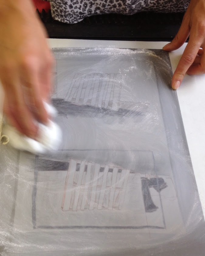
The image created which can be drawn directly onto the plate or traced on via transfer paper coated with ferric oxide. The plate is then 'gum etched' and different levels of phosphoric acid to higher ratio of gum makes the image appear 'more' as you intend. The term 'tusche wash' reminiscent of a very private bathroom activity, allows for soft tonal blends to graduate over certain areas of your design giving a softer and more painterly feel.
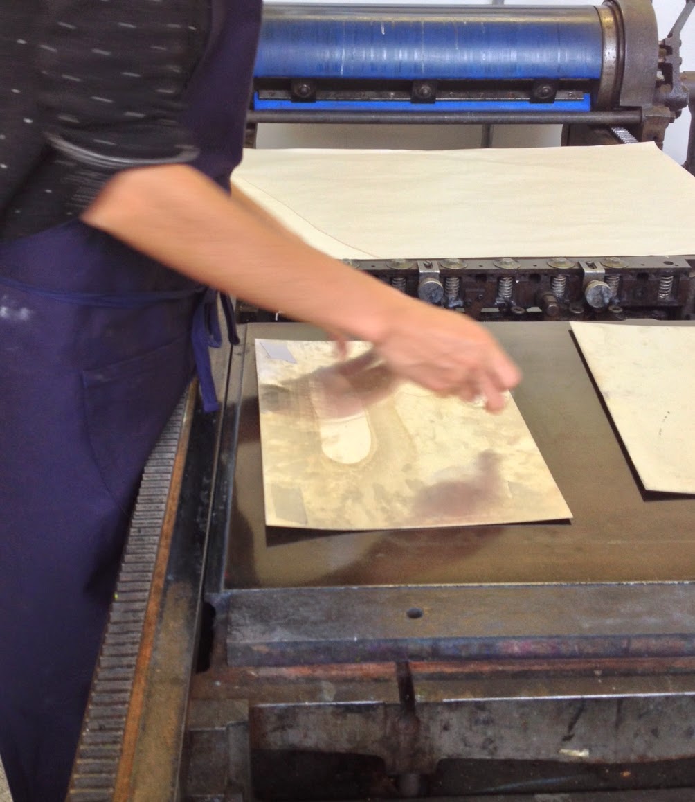
I think the more 'familiar' way my image looked and actually felt after transferring my design onto the hard metal surface (like traditional drawing) made this process much more satisfying and overall made for a more successful final outcome in my eyes. I was pleased with my results, rather than the inadequate scrapings I achieved with etching. 

Once the plates had been talcum powdered, re-gummed 'puddled in' and inked up, the final stage - rolling out my first litho print- was a mini revelation (think finding a pound coin down the side of your sofa when you first thought it was a button)! 


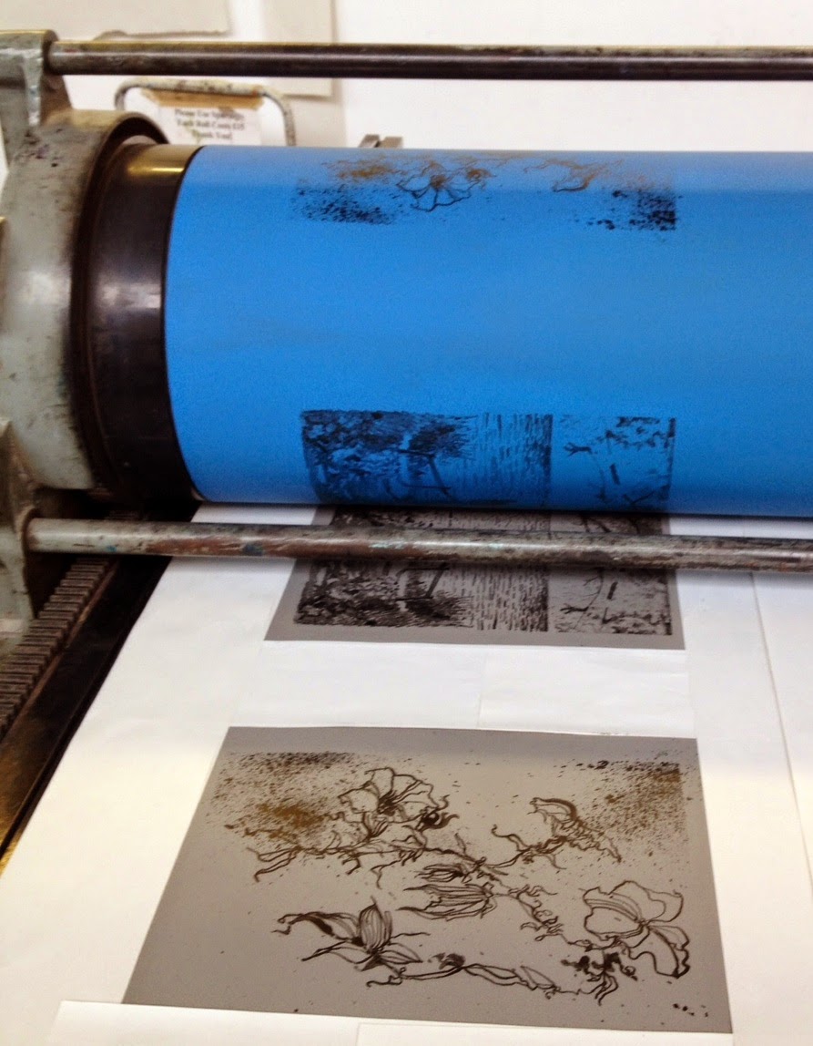
It is amazing that I can reproduce many 'fresh' looking images from one inked up plate with no loss of detail or crispness of line. I think the textured marks and vibrancy of colour that this process allows is inspirational and more akin to silkscreen. I love the work of Toulouse-Lautrec, particularly his images of Jane Avril the good time girl who did not have it so good.  The brightness and clarity of this work is still strong and 'fresh' even after over a century. The romance evoked in some of Toulouse-Lautrec's graphic posters using this process spills over into the quintessentially British imagery by the doomed artist and war hero Eric Ravilious. 

Constructivism, Futurism and the art of the War posters have their place here.


 Imagine it, this is the concept of 'giving life' to a tangible creative reproduction. The Ascent of Man it's not, but that doesn't diminish this process any less.
http://www.theguardian.com/science/blog/2014/oct/14/brian-coxs-human-universe-presents-a-fatally-flawed-view-of-evolution

For me, the soundtrack to this process and the solidity and sense of 'forever-ness' these images produced, I was reminded of the lines from the song 'Photograph, by Ed Sheeran;

'...We made these memories for ourselves,
Where our eyes are never closing
Hearts are never broken
And time's forever frozen still'.


https://www.youtube.com/user/EdSheeran


Talkin' bout a Revolution not Evolution.. Eat your heart out Jacob Bronowski.


Saturday 25 October 2014


Legends of Lithography

Eric Ravilious and me.

23rd October  2014

Lithographic printing was a paradox. My previous experience of the process was disappointing at best (a clumsy washed out scummy texture on stone - slimy yet dissatisfying) and after last weeks' 'schadenfreudic' (sic) experience with etching I was afraid, very afraid. However I really wanted to like it - rather like ones' first taste of an olive - and the process is one of the grand old men of the printing world, rather like the aforementioned Eric Ravilious; who apparently was 'inordinately fond of tea'


Phil Bowden was our 'Brian Cox' of Lithography. We started with Evolution; finding out that a Litho stone is perfect for printing because it is composed of pure Bavarian shellfish. This prehistoric recipe apparently creates a fine, dense and even surface for printing is also fabulous for fossils and rocks a pair of lederhosen. 
Using an Aluminium plate instead of a Limestone for this Litho workshop was more cost effective and much easier to carry around the studio, unless you happen to be Popeye. So after tracing our images down onto the plates we had a variety of greasy media to choose from to make our textured marks. I chose dip pen with Litho ink to draw out my botanical illustration. This created a loose and relaxed line which was much more satisfying than carving into copper or acetate (as in etching). It was comfortable and felt like drawing.

Thursday 16 October 2014


Etching

Eat my Shorts.

16th October  2014

Etching, Aquatints and Drypoint were unknown processes to me - techniques which I had been exposed to briefly a lifetime ago when an art student. The word 'Alchemy' sprang to mind and the terms Ferric Chloride, Acid resist and Bitumen resin hung heavy in the air like the smell of the printing ink. Dave Sully assisted by Isaac gave an informative but gentle introduction to this precise and rather meticulous process.

A Copper plate (once de-greased) is covered in a Bitumen and Bees Wax ground and rolled flat. Onto this smooth marmite-esque surface heat is applied in the form of a candle to bond 'Air Soot' onto the plate. The soot covering the acid resistant layer allows you to see more clearly the fine copper line you create when drawing your image onto the plate.
It is important to remember that the printed image created is the mirror image therefore text must be reversed out.

I attempted to recreate the flowing lines of my life drawings but I found my normally loose drawing style very difficult to replicate. This was frustrating and working into the smooth shiny metal with a sharp, tooth-like needlepoint was like scratching my fingers down a blackboard - curves were clunky to achieve and unlike the fluid freedom that pen, brush and even lino cutting tools gave me, I found I was very disappointed with the results.

After scratching and scraping the coppery surface the plate is placed in an acid bath (Ferric Chloride is used as it 'bites' harder into the metal and gives more control, which in turn allows for finer drawing). The acid eats away at the metal leaving the areas covered with black ground undisturbed. The time spent in the acid is dependant on the lightness or heaviness of line required. An hour or so was the specified time for my acidy design.


Once the initial design has been revealed by the greedy acid monster, in order to prepare the plate for printing,  the sooty cloying resinous surface has to be carefully removed with solvent cleaner and gooey black ink is then applied with what looks like a miniature 'boxing glove' or large bingo dibber, to secrete ink into every available nook and cranny. Then any residual ink rubbed away using 'Scrim' (I intend to insert this word into my everyday vocabulary). The plate is then placed onto the press bed and pre-soaked paper placed on the top, followed by a piece of tissue, then the felt blanket covers it and you're ready to roll. 


My disappointment spilled over into my experimental 'Drypoint' test images. The Drypoint process is similar  but omit the acid bath and any biting occured was me masticating my way through chocolate fingers and shortbread left over from last weeks 'Welcome 1st years' party.

Dave, like a much younger and beard free Dumbledore, was magic - on hand with advice and kind words, praising my efforts despite my design having the look of an hermaphrodite carrying a set of golf clubs.

However, I intend to work on my etching technique but perhaps try a more sympathetic media for my future ideas.  I realise I prefer more fluid and immediate results. Silkscreen and Relief printing may be the way forward with a combination of textural experiments. The theme of 'Texture' is an avenue to explore further. 

Peter McGrath
My friend, the artist Peter McGrath has the hand of an alchemist. His photographic studies and paintings are descriptive observations of the human condition both fragile and powerful. Beautiful textural photographic work and an eclectic range of tactile organic oil paintings combine the figurative with the abstract.  http://www.petermcgrath.co.uk/


I also look to the work of Jonathan Borofsky who produces images which are figurative but also contain large, flat expanses of bold colour. His  Five large paintings from the 'Human Structures' series (2009) is particularly impressive.

'In this series...Borofsky continues to express the most integral theme in all of his work - that everything is connected, and All is One'.


Bite me.


After 'Le Corbusier' and 'Matisse'

Life Drawing and all that 'Jazz'.

16th October  2014


I prefer drawing to talking. Drawing is faster, and leaves less room for lies.  Le Corbusier


Le Corbusier and the Concept of Self

 By Simon Richards, Le Corbusier

Le Corbusier: Elements of a Synthesis

 By Stanislaus von Moos


For me, vibrant flat colour and a flowing key line are a way in which figurative imagery can be translated. In this way, life drawing is an exciting process for me; extracting and attempting to visualise a living creature using line and tone, producing a continuous line drawing. 
La Danse 1 - Matisse (MOMA NYC)


Autant Couche Que Debout 

Matisse and Le Corbusier are influences on my work. Matisse with his quick and expressive figures appear to capture fleeting moments in time. 
These 'Snapshots' of block colour and twisting shapes are reminiscent of fleeting memories. 

Le Corbusier figures - similar stylistically to those of Miro and Picasso - one image (albeit a lithograph)  'Autant Couche Que Debout' became the theme for my next workshop.


My own series of life drawings; overlapping figures which were constantly moving, warm and fluid, became an amorphous mass of shapes. It was my intention to use these sketches as the basis for my etching workshop.

My bad. 


Sunday 12 October 2014

Relief ?... Printing

Fly me to the Moon.


9th October  2014

I began this, my 4th day, with a sense of childlike excitement. I believe now that it's better to have no rigid preconceptions of the process and to work with the high octane energy level of a child on Christmas morning; a little like the feeling when you burp after eating a sherbet fountain, all sweetness and fizz. My ideas are ethereal and unformed, revolving around Organic subject matter (with direct links to my sketchbook objective studies) then becoming darker, more indistinct Freudian creatures, involving war and obsession.

The chemical smells of the print room evoked memories of my previous college experiences  and Gilly's natural enthusiasm for this process gave me a sense that within the parameters of print, anything was possible. The solvent based inks reminiscent of 'journo' men in shirt sleeves with a 'fag on' typesetting hot metal, was the basic scent to our day. 

We were introduced to 'Reduction Prints' where the lightest coloured ink is applied first and darker shades built up to complete the final image - using Lino as the vehicle for our initial designs. I began drawing up images with which to experiment. I found the relief ink more satisfying to handle than silkscreen acrylic as the gelatinous medium was thicker and more substantial to work with. Transparencies could be created using extender base and using the roller to mix and prepare the ink for transference to the Lino surface was strangely attractive. 


The technical problems I encountered were generally linked to the registration of my print and uneven packing of the press. I found that with my 'Popeye' arm muscles it was easy to pull vibrant looking prints. What I loved about this relief process (as with silkscreen), is its immediacy. The ability to produce a design as if by magic  - removing the packing and slowly revealing that juicy image with amazing depth of colour - that's Frank Sinatra on toast is that!

My 'scorpion' illustration worked well as the fluid way in which I was able to control the Lino cutter to create wavy lines enhanced my idea of creating a piece which was organic and flowing. As a work in progress this was a pleasure. However I am drawn to the work of the German Expressionists; images which are more angsty and edgy in nature. The bold thick lines and heavy carved portraits of Erick Heckel and Ernst Ludwig Kirschner - the bombastic block prints using slabs of vibrant colour in an aggressive, animalistic almost tribal manner is an area I wish to research further.


Arnolfini Publicity Poster

In parallel with my initial thoughts, I read the article by Florence Waters (Telegraph 4th October 2014) on the newly published book 'Art and the Second World War' by Art Historian Monica Bohm-Duchen
Waters analysis exploring the question of the possibility of 'enjoying Fascist art' made me wonder if it were possible to express certain social, political and artistic subjects in the form of mini shrines.  (Coincidentally Bohm-Duchen curated a German Expressionists Retrospective exhibition in the mid 1980s at the Arnolfini in Bristol along with Roger Cardinal and John Willett)

Would the idea of creating imagery to express an intangible idea be too superficial or subjective? Could I, like Dr. Frankenstein, with my butterfly brain, take the idea of 'The Shock of the New' or ' Of Gods and Monsters' by Robert Hughes (Guardian article 1/2/2003), where the work of Albert Speer and his relationship with Hitler and the Third Reich is scrutinised - with Speer the repentant Nazi or a man in denial. 
Could I fashion or dissect this premis or a series extremes into any form of print based Shrine?

Scorpions and Sherbet. Heckel and Hitler. Take those Fascists and Fly me to the Moon I think.
Shrine of myself. 11.10.14. Discuss..

Banter!!


Monday 6 October 2014


No. 89 

Actinium - Ac.


6th October  2014

Atomic number: 89
An Actinide, considered a Transition metal - radioactive metal, silvery white, glowing with an eerie blue light, sometimes with a golden cast.  


In Devon with my friends (Big Al and Claire: Ac - Actinium) looking at the cerulean blue October sky life seemed perfect and endless; warmth, smiles and sunlight - simplistic pleasure. The 'eerie' blue and the initials of Al and Claire (Ac) i have linked tenuously to the radioactive metal Actinium and the scene playing out before me, as I watched some children throwing flowers and pebbles into the waves and an old man placing flowers on a bench by the sea - both acts of remembrance, one a childish affirmation of life and one an affirmation of the dead. There was a small 'shrine' hollowed out of the side of the cliff which celebrates the life of a 'lovely wife' and this reminded me of the beloved teddy bear 'Alan Measles' belonging to Grayson Perry. The toy being Perry's own personal shrine to childhood and a 'childish affirmation' of life. 


"Alan Measles is my fifty year old teddy bear. He was the benign dictator of my childhood imaginary world, where his roles included surrogate father, rebel leader, fighter pilot and undefeated racing driver. I was his bodyguard for he was very precious to me because I had given him all my male qualities of leadership and rebellion. Now he is a guru and living god in my personal cosmology."

Grayson Perry  (alter-ego Claire).


I like the idea of a shrine which celebrates the everyday and finds hope in the ordinary. I would like to explore why we put our faith in the familiar; objects and imagery which bring comfort. The search for the 'quintessence of life' perhaps? 


My friend the Photographer Alan Cossey's exhibition of 'Constructed Still Lives' illustrates the point exactly. Find below a description of his specific work...

Constructed Still Lives 
" It is said that we live our lives as if we are immortal. Leave that 'til tomorrow, we can do that next week, month, year.

Part of the thinking that we are always going to be here manifests itself in the same way we collect objects, creating little still lives, things that will always remain the same, things that will always be there, a constant in an ever changing world. A constant that includes us, making us feel secure and that in some way proves that WE will always be here. 


In my photographs I have looked at the way in which people put objects together, things that they look at every day, things that make them happy or remind them of happy times... symbolic or religious significance. So here we have photographs, ornaments, drawings; sometimes mixed with the ordinary objects of everyday life; sometimes on their own as discreet statements, but all meaningful to the people who put them together in their homes. 


So ironically, death is present in our attempt to construct immortality. Things are transient - flowers in our still lives will die; children's paintings and letters will be removed and replaced..."
Alan Cossey - photographer
'Constructed Still Lives' exhibition
(1 of 12 works)

http://media-cache-cd0.pinimg.com/236x/72/82/62/728262fc47d8c138705233ff827f45f8.jpg

http://photos1.blogger.com/blogger/704/240/1600/grandpagreg.jpg

http://www.brooklynstreetart.com/theblog/wp-content/uploads/2011/09/brooklyn-street-art-dan-witz-9-11-shrines-Montage1.jpg

http://kookykoolkreations.com/wp-content/gallery/shoe-shrines/caged.jpg

http://media-cache-ak0.pinimg.com/236x/74/ba/a1/74baa13de3fa4a224f254e70ebb19f94.jpg

http://www.helenramsaran.com/Shrines/AWoman'sShrine.jpg

http://www.atcsforall.com/swaps/image2009/matchbox2009.jpg

http://michaeldemeng.typepad.com/photos/demeng_art/the-strange-shrines-of-saint-someone.jpg

As Grayson Perry says " I love a good shrine. Shrines to me embody the essence of what I do. I put significant artefacts in a special place for us to contemplate. The special place could be in your pocket, in a corner of your house, by the roadside..."

My own 'Alan Measles'

.. or for me a small beach on the north Devon coast on a sunny sunday.


Thursday 2 October 2014


Workshop One 

Sausages.

25th September 2014

It's as if an ice age, a milennia, eons have passed since I accepted my place on this MA Multi-Disciplinary Printmaking course. I am Yoda. To have actually arrived here today, sitting in the unnaturally warm cream room (full of creative hope and a skinny latte) listening to Sarah, Paul and Ian talk about what it means to be an MA student,  I have an overwhelmingly strong desire to whirl like a dervish and throw glitter with joyous abandon.
This day has been such a long time in coming and my proverbial 'road' has been strewn with  distractions, demons and dirt. Therefore it is my intention to hoover up every possible piece of creative debris. Today is all about introduction and insight. This voyage involves familiarisation with the fabric of Bower Ashton ( my memories from 15 + years ago flooding back) and the structure of the course.

Printmaking (sights and smells) , Silkscreen, Etching, Fabrication, Ceramics, The Library, Information Points, Students Union, The Art Shop etc. with the smile welded to my face; meeting fellow students and staff (both familiar and less so).  
Being here, I am aware how vital and important creativity and art is. How the feeling underpins my desire to share this importance with the students I teach and develop my own work.

I spend the day in a haze of excitement with a sense of deja vu - writing notes, sharing 'banter', looking at the work of Theo Jansen, Tom Stingle,  Alex Frost, Thomas Demand  and the interactive work of Daniel Rozin http://www.smoothware.com/danny/ , to name a few. I learn that 'questioning reality ' is the way forward, Printmaking can be explored in a myriad of forms and it's best not to get your tongue pierced because it hurts when you say 'sausages'. 


Day Two 

Silkscreen.

2nd October 2014

Signing in today like the newbie I am. I'm still over-excited at the prospect of another day at Bower Ashton. I have embarked on the 'Sketchlook' exhibition. I have been given a beautiful sketchbook to fill with my creative chunks which will then be sent to the USA. Awesome dude!  Another reason to be cheerful today - The Silkscreen workshop. It began with sketchbook preparation, working with a variety of textures and the idea of abstract mark making which coalesced into a final creative piece. I found that this final outcome could be taken in any number of directions or discarded and reinvented. Dave Fortune the God of the vacuum bed (with his game show host style banter and twinkly, crinkly eyes) gently led me and my fellow disciples of Print through the maze of techniques and watery processes culminating in our individual experimental outcomes. All work produced was unexpected and all work was innovative causing us to coo like excited children at a firework display on the unveiling of each new print.

I was introduced to the Water-Based Screen Printing process using acrylic colour. Grainy textures and delicate washes, reminiscent of Litho were achieved on drawing film, with the addition of lace fabric and rubbings. The sensitivity of the marks made using chinagraph pencil and dip pen combined with a delicacy of line allowing for a diversity of form. My initial figurative designs were discarded as i experimented with a series of textures.
I found that using a fine silkscreen mesh (120 - 150T)  the thinnest of linework can be translated with ease and even type does not lose sharpness or clarity.

This Print process is one I feel most comfortable with having worked with silkscreen as a specialism whilst  doing my Degree. It is also one of the most effective processes which is transferable to the classroom and in my experience children who find translating imagery in a more 'controlled' or 'traditional' manner difficult, find silkscreen printing a much more satisfying means of self expression. The paper stencils of Matisse http://www.henri-matisse.net/cut_outs.html or the large scale explosive works of Julie Mehretu (using the exploration of mark making and directional abstract ) http://whitecube.com/artists/julie_mehretu/ are forms of inspiration as are the vibrant 'monoprint-esque' paintings of Cecily Brown. http://www.saatchigallery.com/artists/cecily_brown.htm

I spent my day experimenting with sandpaper, ink and methylated spirit; working into my design which was constantly changing depending on the media I tried. After 5 hours we had all produced our first prints and we took them away like party favours with Dave, omniscient. (He even conjured up tea and bakewell tarts. A miracle).  

The final stage today was a Careers and Volunteering talk given by two earnest and slightly nervous University administration staff in another very hot, moist, cream room. Then, in groups, we had an initial introduction into the production of our own 'creative journal', whose compilation could be either an iliad or an ill written postcard. The professional nature of some tomes were awe inspiring and critical engagement from the outset is paramount.
' The beginning is the most important part of the work' as Plato said. 

I'm just happy to be here.