V & A:philatelic design

 Currently on display at the Victoria and Albert Museum is the work of Natalia Lamanova and Alexander
Khopolov. These artists have created beautiful examples of philatelic design inspired by themes of personal identity, subjugation and control and work which is a celebration of Russian architecture and history, using a combination of subtle typography, layered digital and lithographic processes.
Currently on display at the Victoria and Albert Museum is the work of Natalia Lamanova and Alexander
Khopolov. These artists have created beautiful examples of philatelic design inspired by themes of personal identity, subjugation and control and work which is a celebration of Russian architecture and history, using a combination of subtle typography, layered digital and lithographic processes.
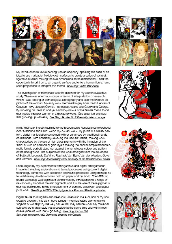
 These images also inspired me to
create my own digital stamp designs - Lamanova's 'passport' piece is digital print like my own - and this process is reflected in the quality and clarity of the finished artwork.
The scale of my final A4 stamp sheets enhanced these tiny Madonna-esque portraits, making them visually more attractive, intensifying their colour and design detail and producing uniform repeat patterns reminiscent of a fabric or textile print.
I included perforations (and
hand rendered dots are used to represent rows of holes for my InDesign file examples) in order to physically separate each individual stamp.
Therefore, on an A4 sheet each image appears as a single portrait in its own
right with selected type linking to each Renaissance image and a selvedge to mark the edge of the sheet as in Lamanova’s work. My series of final outcomes reflect both a nostalgic and contemporary view of these miniature framed Madonnas.
These images also inspired me to
create my own digital stamp designs - Lamanova's 'passport' piece is digital print like my own - and this process is reflected in the quality and clarity of the finished artwork.
The scale of my final A4 stamp sheets enhanced these tiny Madonna-esque portraits, making them visually more attractive, intensifying their colour and design detail and producing uniform repeat patterns reminiscent of a fabric or textile print.
I included perforations (and
hand rendered dots are used to represent rows of holes for my InDesign file examples) in order to physically separate each individual stamp.
Therefore, on an A4 sheet each image appears as a single portrait in its own
right with selected type linking to each Renaissance image and a selvedge to mark the edge of the sheet as in Lamanova’s work. My series of final outcomes reflect both a nostalgic and contemporary view of these miniature framed Madonnas.
Natalia Lamanova (1964)
 Passport and war card
2002
Natalia Lamanova works in
graphic and digital media. Her prints are often arranged like sheets of postage
stamps with perforations for separating the individual stamps and a selvedge or
self-finished edge that marks the end of the sheet. These images come from a
passport photograph of the artist and photos of her partner Alexander Khopolov,
perhaps from his military identity card. They suggest issues of national
identity and the limits of state control.
The stamps each bear slightly variant images of the same
symbols for 'This way up' (an open umbrella) and 'fragile' a wine glass, plus
variant lettering in Russian and English including the words 'LAMANOVA' and
'This passport'; the artist's date of birth and a date-stamp of 1999. The
central image of each stamp is a passport photograph of the artist. Each is a
different colour: red, pink, blue and green. The predominant colour of the
sheet is greyish pink.
Alexander Khopolov (1948 –
2016)
 80 Moscow Manhole covers
1996
 Alexander Kholopov was a
leading exponent of mail art and the artist’s stamp. This set of collectors’
stamps parodies the patriotic souvenir sets published by the Soviet government
to celebrate architectural landmarks or technological achievements. Each stamp
is dedicated to one of the events and personalities from history, the arts and
popular culture that inspired the artist over the years. This work is a set of lithographs.
Alexander Kholopov was a
leading exponent of mail art and the artist’s stamp. This set of collectors’
stamps parodies the patriotic souvenir sets published by the Soviet government
to celebrate architectural landmarks or technological achievements. Each stamp
is dedicated to one of the events and personalities from history, the arts and
popular culture that inspired the artist over the years. This work is a set of lithographs.


