Tuesday 29 December 2015

THIS IS NOT MAGRITTE's PIPE

Can we really judge the familiar or common because in reality we all have preconceptions of it; we've already made up our minds about a person, portrait, subject or object. Therefore one can no longer be truly objective - a preference can be expressed but without objectivity. The commonplace is taken for granted, well-known through long or daily association. We look without seeing. 

Here started my exploration of divergent ways of working with the figurative form, challenging myself to create artwork using and combining  a range of media, technologies and equipment that are unfamiliar. 

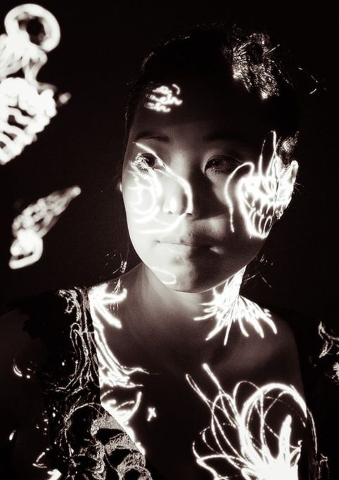
I like fluidity, the organic and free form. Therefore the combination of using Lino with a sharp blade or photographic or silkscreen imagery which is then projected onto textiles to create soft curves and emulate the human form can be achieved. 

I found using wood blocks too unwieldy. (Due to my my inexperience and lack of control when cutting in to the surface of a block, this process was unsuccessful. It made the precision needed to create curves frustrating). Lino worked much better in order to achieve a more expressionistic and textural linear form especially for figurative work. Also repeat pattern was easier to replicate on a variety of surfaces with a particularly pleasing textural quality. 

Examples see: Lyonel Feininger
Untitled street scene - double exposure (1929-30)
Andreas Gursky
Pattern and paradigms of the repeat. 

Acrylic paint on acetate worked well for linear projections on to skin and canvas. The contrast between the painted line on a curved surface was particularly evocative. 

I used the copy camera with George to produce a series of large scale film positives of my 'Klimt' inspired life drawings which can be used for initial projected designs or textural silkscreen prints. Also I have combined my botanic illustration studies of flower forms as patterns on naked skin and translucent fabric which I then photographed and interpreted as repeated designs using both digital and traditional printing methods. 


Retro Textile Patterns


Patterns which reflect and personify 'self'..solipsistic? All my initial digital fabric work has begun with an image reflecting an emotional epiphany; kaleidoscopic trees, a child's doodle, an Australian sunset concealing a devil in disguise or have been taken from eclectic sources which are personally iconic ie. film, slide and photographic film and printed ephemera.

Some of my designs have then been transferred from digital to dirndl, with the material steamed, washed and hung with care by Becky the Beautiful. Each piece is a sketchbook reflection; a snapshot taken and manipulated from a facet of daily life and the fabric chosen is an example of the subject portrayed - depicting a slice or swathe of humanity perhaps?


ONE DirectionNEW Direction

29th December 2016


Harry Styles is not my bag but Harry Seidler is. Kurt Kranz, Bauhaus imagery and influences which parallel German Expressionist stylistic linocuts have been the inspiration for a variety of my work for the Developing Practice module.
   

"Photography is painting with light"
Miroslav Tichy


I am interested in the idea of camouflage and pattern- using the human form as both reference and canvas with the printed image (specifically a combination of the photographic and digital) which is now more prevalent in my work. My light projections and photographic imagery have become the springboard for further exploration into textile, silkscreen and most challenging and interestingly for me, projected print. 
The work of Mat Collishaw, specifically his work involving Crucifixion projections of 1990 as part of the Modern Medicine exhibition has been inspirational.
http://matcollishaw.com/works/crucifixion/  The overlapping styles using mix of transparent and textural with a propensity of linear and abstract are interesting means to develop projected abstractions using the human form as a key line.

Gueorgui Pinkassov Tokyo Businessmen 1990 
Examples of 'impediments to clarity' and 'camouflaging reality' can be seen in the work of Gueorgui Pinkhassov. In my opinion, his reportage imagery from the 1990's is reminiscent and an amalgam of the Bauhaus, Collishaw and Rodchenko, where his portraiture is interrupted by shadow. The work of Kurt Kranz too mirrors this theme.
Mat Collishaw 'crucifixion' 1990 Projection

Kurt Kranz 'Portrait of Otti Berger' 
With all my current experimentation, I have tried to incorporate the styles of artists who excite and inspire me and also using coloured, textural or movement of light as a printing medium, whether distorted, directed or projected, has become a new direction.
The moving image too is an excellent way to create emotive pattern or 'impede' the clarity of your subject. I have begun looking at colour halftones and pixellations to distort my canvas and photographic work. Again the work of Mat Collishaw and the photographs (1980s) of fashion photographer Guy Bourdin, where colour and camouflage alter the perception of an image, have been influential. The theme of 'retrospective' using film stills from the 1960, 70s and 80s as patterns 'hiding' the figurative are other forms of my emotional exploration. 
Therefore, I may have all the myopic tendencies of Mr. Magoo but creating prisms of paradise using film and projected beams of light feels mighty fine.

"Painting is a blind man's profession. He paints not what he sees but what he feels"Picasso


Friday 11 December 2015

Packaging the human form

10th December 2015

Pattern and vibrant colour creating the illusion of seductive camouflage is the thread binding my current photographic imagery. The series of bold photographic projections taken in the studio using an SLR camera, digital projector and using the skin of Rhyannan my life model as the canvas, have inspired my use of developing varied linear organic shapes on a curved surface. This abstract approach has lots of potential and I am interested in exploring this aspect in more depth. (see work of Emma Hack and Vadim Stein)
In my work I am attempting to develop the theme of packaging; covering the human body using a range of repeat and abstract patterns in vibrant colours and alternative fluid shapes. These are taken from my own figurative silkscreen, lino and acrylic painted designs which coalesce when
projected onto curved forms - with particular imagery relating to the personality or essence of the specific person encased within. 
(Inspirational examples of this have been taken from a range of sources ie. Yayoi Kusama, Maurice Binder and Robert Brownjohn, Alli Jang). My thoughts have been directed to the theme of Butterfly to Chrysalis, Frankenstein, Chameleonesque camouflage and a myriad of textural coverings which could alter our perception of the human figure, hiding or sculpting the organic so that it blends seamlessly with any environment. 
From my own research I have found that projecting solid blocks of colour works and strong linear patterns work most effectively. This led me to take inspiration for my own projected linocut designs from the work of German Expressionists and to a lesser extent Matisse. (see Otto Dix, Ernst Kirschner, Egon Schiele).


An extreme example of this is the fashion designer Iris Van Herpen who collaborated with the Belgian artist Lawrence Malstaf and vacuum packed her models on the catwalk taking the packaging idea to an extreme. 

I am using a series of contemporary artists to assist with my quest for creative diversity with emphasis on the human form; specifically Peter McGrath (portraiture and psychology),  Miss Bugs (chameleon-like vibrant silkscreen mixed media) and Martin Maloney (colour female collage 'Actress Slash Model').


Examples of projection Ideas and further relevant inspiration

http://www.judybarrass.com/Berbagi.html

http://judybarrassblog.com/2014/06/24/projections-for-floating-land-2013-revisited/


http://margaretnoble.net/educator/the-art-of-projection/


https://www.youtube.com/watch?v=oYw_vVxw8tg

maurice binder

https://www.youtube.com/watch?v=ngf1Lryep1o

robert brownjohn


Maurice Binder and Robert Brownjohn's innovative 1960s representation of the human canvas can be seen in their title sequences of the early 'Bond' films eg. Dr. No, Goldfinger. 

https://stazouvou.wordpress.com/page/4/
anastacia stazouvou - life drawings illustrating FGM

http://emmahackartist.com.au
Emma Hack's beautiful and evocative combination of vibrant colour and pattern camouflaging the body within a flat surface is inspirational. 


http://www.allijiang.com


Yoyai Kusama
Kusama's idea of 'Self Obliteration' is relevant to my work too and some of her pattern work specifically the organic sculptural forms is reminiscent of my own large scale flower canvasses.

"Painting bodies with the patterns of Kusama's hallucinations obliterated their individual selves and returned them to the infinite universe". Yayoi Kusama


DIY

November 27th 2015

I have been looking at the best material for projecting my images onto in order to create my own 'skin' style canvas. I want a medium which was malleable, permeable to light and colour and tensile enough to stretch seamlessly over the human form. This stretched material would then be a base to project my life drawings and possibly 'retro' deconstructed silkscreen images onto.
As you know I am interested in the idea of Camouflage and this theme works in parallel with my projections. I want to try to hide the human figure and human face within a miasma of colour and fluid line.

White Lycra or Spandex appears to be the DIY projection screen of choice - also white vinyl works too. In trying to source this material found that projector screen material is a form of vinyl. Grey and Pearlescent 'flat' vinyl screen colours are effective for different reasons.
with grey vinyl the images appear brighter and are 'viewable from more angles'. Matt white is a good all round colour, however, pearlescent gives the best contrast.

Take a look at this video on YouTube: think man in brown overall sawing and coughing in a shed...
http://youtu.be/d-WWm8f3nyk

Examples of Screen and Wrapping Material

White seamless paper for Photography
This is advantageous as an 'efficient' alternative to vinyl or fabric in a controlled studio or staged setting. However the paper must be fixed and tensioned so that the image is not distorted.

Vinyl for moving or still imagery
This is a more expensive option for projections but can be used unsupported or backed by textile vinyl.

Rubberised Canvas
The advantages of this is that this material can be folded or durable and can be used for interior or exterior shots.

White Pearlised Spandex 
This is the most effective material for my own projections and what I used for the initial studio shots.

'What will survive of us is love..'

5th December 2015

'Take a moment from your busy life. Take some time to reflect on Death......what does it mean to you? How does it feel for others? The journey we will take affects the way we live. Let's talk about Death'.


Bristol Museum and Art Gallery 
24th October 2015 - 13 March 2016

Much of my work is concerned with the human form, our physicality and to what it is to be human; attempting to deconstruct aspects of humanity in so much as we ourselves are the canvas. This exhibition, featuring over 200 items dedicated to showing how human beings have approached death and dying around the world and across time, was a good place to start.

From the Mexican Day of the Dead and Victorian mourning rituals, to mummification practices and fantasy coffins, this incredibly diverse exhibition reveals stories behind the most universal of experiences. It was curated by Amber Druce.

"A dead body can be seen as the ultimate representation of death. Buddhist monks meditate on the different stages of decomposition, known as the 'nine cemetery contemplations'.The aim is to understand that no one is bound to their body forever."

I found the English accoutrements of death - mortuary slab, the 'time of death' clock, the shroud, the coffin etc. rather jarring, with the addition of the 'wrapped body' forcing one to confront the finality and the physical reality of the end of life. Alongside the clinical death experience there was an array of sculptural and decorative objects showing how death is approached in other cultures and here it appears as an obvious 'celebration' of life (Mexican Day of the Dead). One gets a sense of the departed moving on whilst still being part of the here and now. Therefore from horror to heaven the array of ' Vanitas' paintings, sculptures, talismans and religious artefacts gave an insight into the ceremony and celebrations surrounding death. The shrunken heads and Mayan death masks were particular favourites of mine.


'What will survive of us is love' wrote the poet Philip Larkin. What physically survives is something different. Whether we are buried or cremated, our bones can remain for hundreds, even thousands, of years. What we choose to do with those remains can depend on whether we see them as part of the person we loved in life or just the empty shell of that person.